LockerLife
Logistic Solution Provider
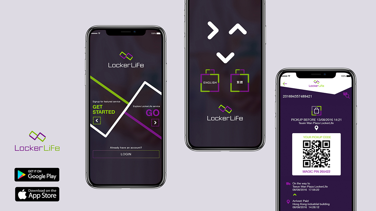
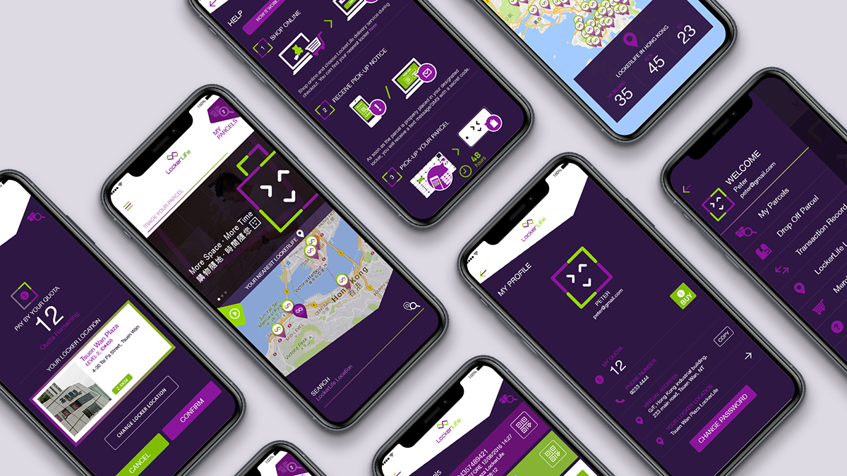
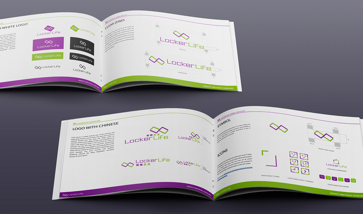
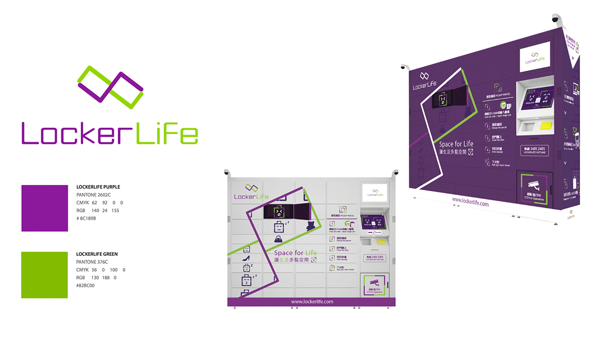
Lockerlife is a new logistics solution provider for B2B and B2C. The logo of LockerLife was created by 4 "L" shapes, it forms lockers and infinity symbol. The overall design concept of LockerLife is about space for life, this is part of our life, full of surprises, we love imagine and explore the possibility in our life. The key visual - showing different emojis were created by L shapes means catching the surprises which LockerLife gives to their customers.
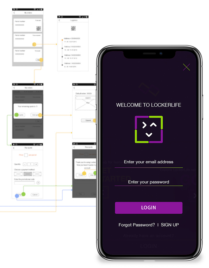
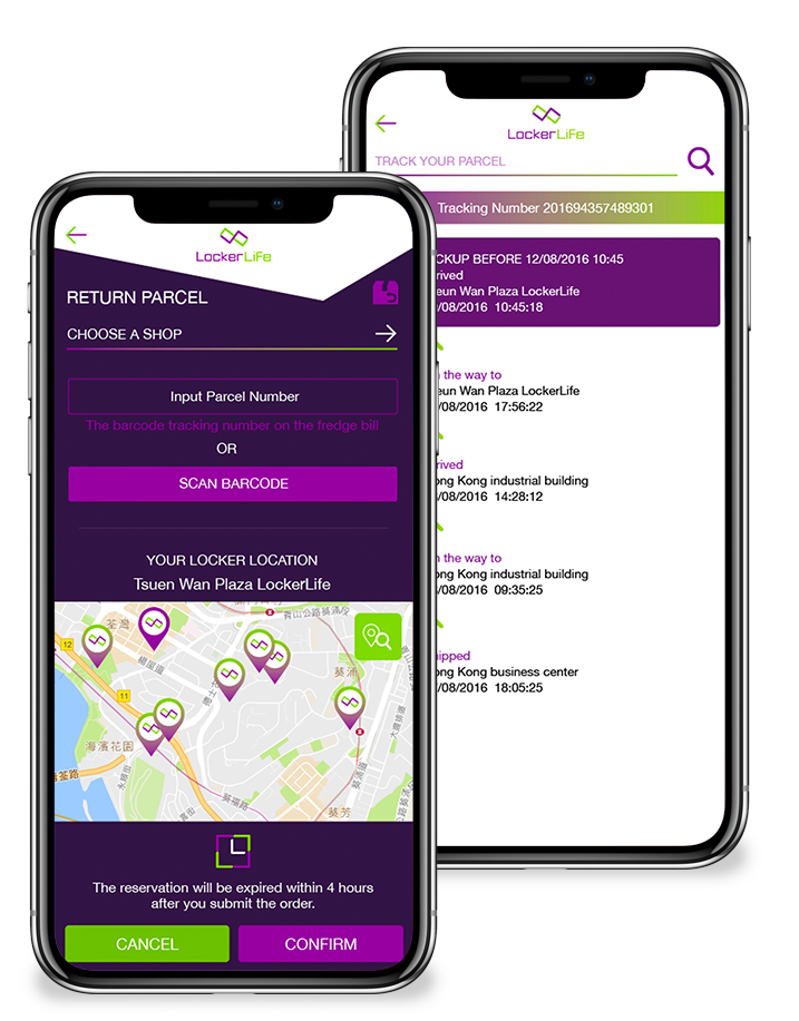
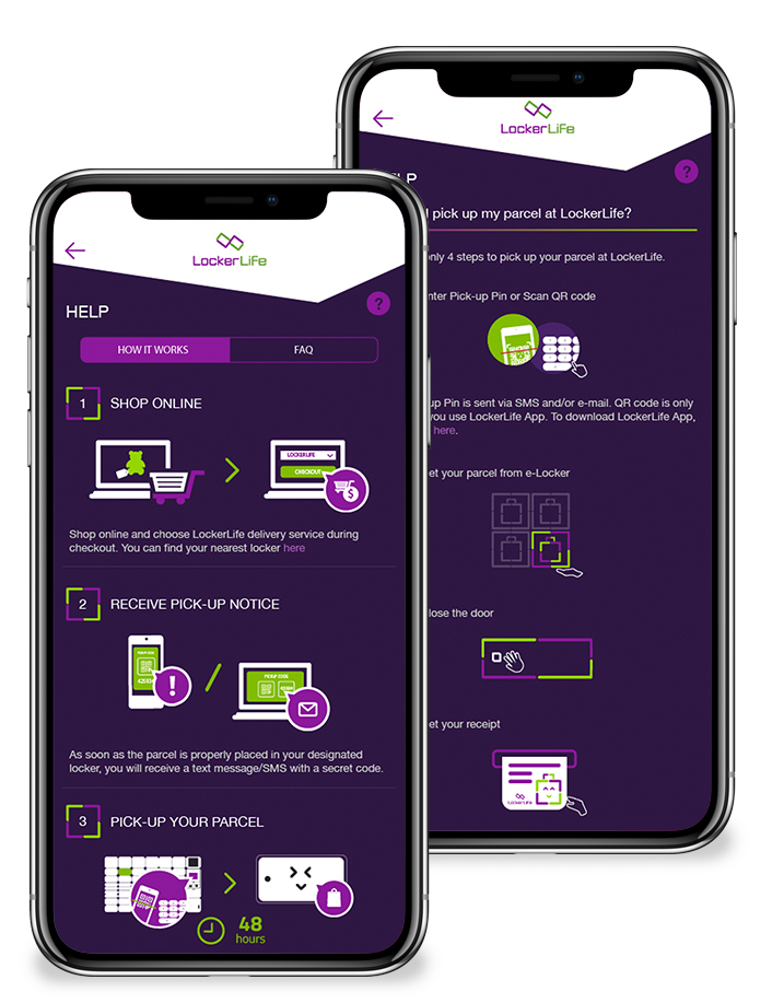
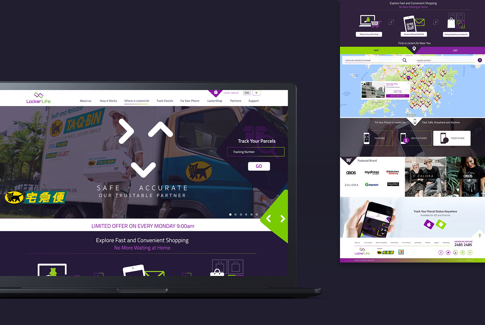
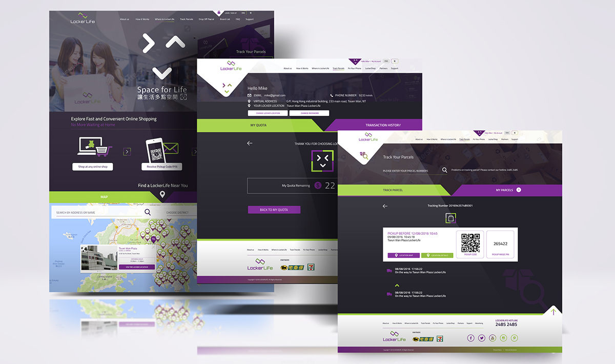
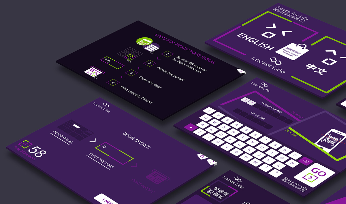
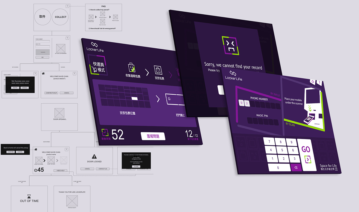
Roles in this project: Branding, UX/UI and graphic design, including touch screen, mobile app, website, locker design.

“Good design thinkers observe. Great design thinkers observe the ordinary”
Tim Brown
Catherine Leung.
